
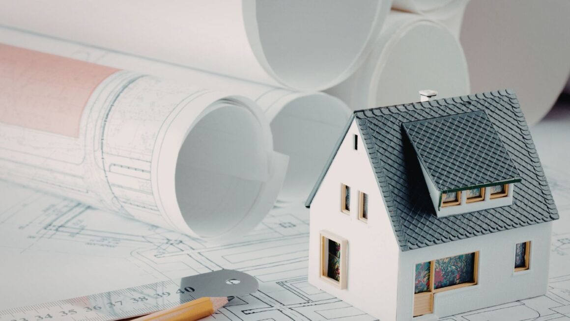
Architecture has a communication problem that rarely gets discussed openly. The people who design buildings are trained to think spatially, to read drawings, to translate flat lines into three-dimensional experience almost automatically. The people who commission, approve, and ultimately inhabit those buildings mostly cannot do this. And yet the design process routinely asks them to.
A client sits across a table from an architect. They look at a floor plan. They nod. They say it looks good. And privately they have no real idea what the finished building will look and feel like, because nobody — not even most architects — can genuinely picture a space from plan alone without considerable effort.
This matters. Misread designs lead to late changes. Late changes in construction are expensive. And the further through the process a misunderstanding goes undetected, the more it costs to fix.
The Gap That Drawings Leave Open
Plans, elevations, and sections are not communication tools in any ordinary sense. They are technical instruments built for a particular professional audience. An experienced architect looks at a floor plan and sees rooms. A client looks at the same drawing and sees lines.
What drawings cannot show: scale as it is felt by a body moving through space. The difference between a corridor that reads as adequately wide on paper and one that actually feels adequate when you are walking down it. The quality of light at a particular time of day. Whether the ceiling in a given room will feel appropriately generous or slightly pressing. How a facade will read when approached from the street at eye level versus from thirty metres away.
Elevations have their own limitations. They show proportion and composition, but they strip out depth. A building’s relationship to the pavement, the way an entrance projects or recedes, the shadow a canopy casts — none of this is readable from a flat elevation without training and experience.
Today, architectural visualization helps translate drawings and concepts into images that clients, stakeholders, and non-specialists can understand much more easily. It does not make the drawings irrelevant. It makes the information inside them accessible to a wider audience earlier in the process.
Form First, Then Everything Else
Before anyone is thinking about material samples or paint colours, a building has a form. The relationship between its volumes, the way it meets the ground, how it reads from different distances and angles. This is often what needs to be understood first, and it is the thing plan drawings communicate least intuitively.
Put a rendered volume study in front of the same client who was nodding politely at the floor plan and the conversation changes immediately. They can see whether the building is too tall for its context, whether the massing feels right relative to the street, whether the entrance is reading as welcoming or austere. These are design-critical judgments that cannot be made without some form of spatial representation.
Materials come next. Brick or timber cladding, pale stone or dark metal — the choice carries enormous consequences for how a building performs in its setting and over time. Showing those materials in a rendered view, under realistic light conditions, communicates something that a written specification cannot. So does showing light itself: the deep shadow a canopy throws across an entrance on a summer afternoon, the quality of north light through a gallery clerestory, the way a courtyard catches and holds sky. These are the atmospheric qualities that define the experience of a building, and they need to be seen to be grasped.
Scale Is the Hardest Thing to Abstract
The single most consistent source of surprise when clients first walk into a finished building is scale. Rooms that seemed spacious on the plan feel intimate. Corridors read as narrower than expected. A volume that appeared generous turns out to feel enclosed.
This is not a failure of design. It is a failure of communication. Plans drawn at 1:50 or 1:100 have a visual scale that does not naturally translate into felt physical scale, even with dimensions noted. A rendered eye-level view of the same space — with furniture at correct proportions, a human figure near a doorway — resolves this almost immediately. The spatial information is just more directly legible.
Where Visualization Fits Beyond Client Presentations
The client meeting is the obvious context, but not the only one.
Planning applications for significant projects increasingly require visualization specifically because planning officers and public consultees need to understand what is being proposed without being trained to read technical drawings. A rendered street scene showing the proposed building in context, or a view from within a public space the building will frame, gives planning authorities something real to evaluate.
Design teams use visualization internally too. Share an early-stage render with a structural engineer or a landscape architect and the design conversation becomes substantially more grounded. Instead of each party interpreting a different drawing set and translating it into their own mental model, there is a shared image — a common reference point that keeps collaborative conversations on track.
For architecture competitions and publications, visualization has become the medium through which unbuilt work is judged. A project that cannot be shown clearly will struggle to be understood, regardless of how rigorous the design thinking behind it. This gives visualization a genuine role in architectural culture, not just in project delivery.
Sustainability Is Harder to Show Than Style
One area where visualization’s contribution is less discussed: sustainable design. The features that give a building its environmental performance are often invisible in finished photography. A passive solar strategy. Natural ventilation through carefully positioned openings. Material choices made for low embodied carbon and long service life. These do not photograph in any obvious way.
Visualization can be used to explain them. Sectional views showing air movement through a building. Diagrams overlaid with shading studies. Rendered sequences showing how light moves through interior spaces across the day and the year. These are not decorative — they are explanatory, and they make sustainable design thinking legible to clients and communities who would otherwise encounter it only as specification language in documents they will not read.
One Honest Caution
Visualization is powerful enough that it can be used dishonestly. A rendered image can make a bad building look compelling. Atmospheric lighting, carefully chosen camera angles, flattering weather conditions — these can all paper over design weaknesses that will be painfully obvious once the building is inhabited. This is a real risk and architects have to live with it, because the same tools that enable honest communication also enable persuasion.
Used honestly, though, visualization is simply a way of letting more people understand architecture more clearly. The ideas that go into a well-considered building — the thinking about site and form, about material and climate, about how space is experienced by the people who use it — are interesting ideas. Most of them can be explained. Visualization creates the conditions for that explanation to happen before the building is built, which is the only moment when the explanation still has the power to change things.